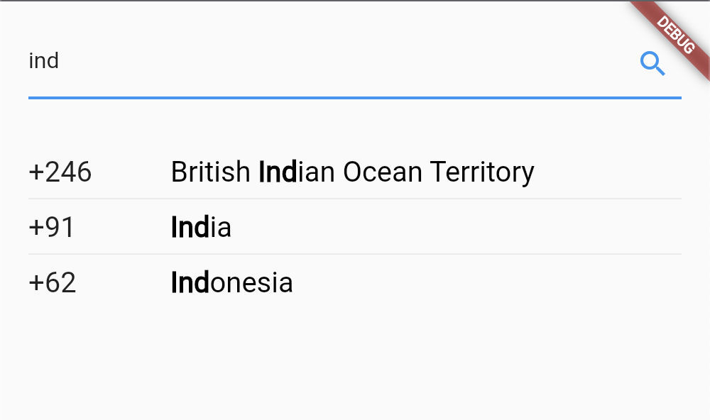
Hey guys, do you ever required to build a Cupertino date picker, similar to the one shown in the image below? But got frustrated because CupertinoDatePicker widget does not bring much (any) customizations. :-(
This article will help you to create one of your own Cupertino date picker, with unlimited possibilities for customizations. :-)
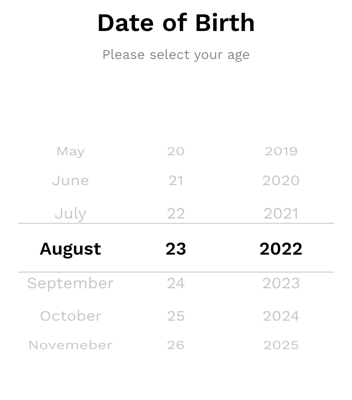
Custom Cupertino Date Picker
Under the hood, the CupertinoDatePicker widget make use of CupertinoPicker widget, which brings some customizations.
We are also going to use the CupertinoPicker widget to achieve our goal!
Create a stateful widget for our custom date picker.
This widget will essentially be a wrapper to the CupertinoPicker widget. Declare all the parameters needed in a CupertinoPicker widget. (You can also limit yourself to the parameters you require.)
class CustomCupertinoDatePicker extends StatefulWidget {
  final double itemExtent;
  final Widget selectionOverlay;
  final double diameterRatio;
  final Color? backgroundColor;
  final double offAxisFraction;
  final bool useMaginifier;
  final double magnification;
  final double squeeze;
  final void Function(DateTime) onSelectedItemChanged;
  // Text style of selected item
  final TextStyle? selectedStyle;
  // Text style of unselected item
  final TextStyle? unselectedStyle;
  // Text style of disabled item
  final TextStyle? disabledStyle;
  // Minimum selectable date
  final DateTime? minDate;
  // Maximum selectable date
  final DateTime? maxDate;
  // Initially selected date
  final DateTime? selectedDate;
  const CustomCupertinoDatePicker({
    Key? key,
    required this.itemExtent,
    required this.onSelectedItemChanged,
    this.minDate,
    this.maxDate,
    this.selectedDate,
    this.selectedStyle,
    this.unselectedStyle,
    this.disabledStyle,
    this.backgroundColor,
    this.squeeze = 1.45,
    this.diameterRatio = 1.1,
    this.magnification = 1.0,
    this.offAxisFraction = 0.0,
    this.useMaginifier = false,
    this.selectionOverlay = const
      CupertinoPickerDefaultSelectionOverlay(),
  }) : super(key: key);
  @override
  State<CustomCupertinoDatePicker> createState() =>
      _CustomCupertinoDatePickerState();
}
class _CustomCupertinoDatePickerState extends
  State<CustomCupertinoDatePicker> {
  @override
  Widget build(BuildContext context) {}
}
In the code above, I’ve explained the some parameters in the comments. To know about all other parameters, please refer to CupertinoPicker doc.
Declare some properties
Let’s declare some properties in the _CustomCupertinoDatePickerState class which will be used in later steps.
late DateTime _minDate;
late DateTime _maxDate;
late DateTime _selectedDate;
late int _selectedDayIndex;
late int _selectedMonthIndex;
late int _selectedYearIndex;
late final FixedExtentScrollController _dayScrollController;
late final FixedExtentScrollController _monthScrollController;
late final FixedExtentScrollController _yearScrollController;
final _days = [31, 28, 31, 30, 31, 30, 31, 31, 30, 31, 30, 31];
final _months = [
    'January',
    'February',
    'March',
    'April',
    'May',
    'June',
    'July',
    'August',
    'September',
    'October',
    'Novemeber',
    'December',
];
You can change the strings of _months list, if you want to display some other texts for months. For example, [‘JAN’, ‘FEB’, ‘MAR’, …].
Initialize & validate dates & controllers
We’ve declared our controllers, now it’s time to initialize them.
@override
void initState() {
  super.initState();
  _validateDates();
  _dayScrollController = FixedExtentScrollController();
  _monthScrollController = FixedExtentScrollController();
  _yearScrollController = FixedExtentScrollController();
  _initDates();
}
Also, we need to validate the dates passed as arguments from the user.
void _validateDates() {
  if (widget.minDate != null && widget.maxDate != null) {
    assert(!widget.minDate!.isAfter(widget.maxDate!));
  }
  if (widget.minDate != null && widget.selectedDate != null) {
    assert(!widget.minDate!.isAfter(widget.selectedDate!));
  }
  if (widget.maxDate != null && widget.selectedDate != null) {
    assert(!widget.selectedDate!.isAfter(widget.maxDate!));
  }
Initialize dates in case, no dates are passed in the arguments.
void _initDates() {
  final currentDate = DateTime.now();
  _minDate = widget.minDate ?? DateTime(currentDate.year - 100);
  _maxDate = widget.maxDate ?? DateTime(currentDate.year + 100);
  if (widget.selectedDate != null) {
    _selectedDate = widget.selectedDate!;
  } else if (!currentDate.isBefore(_minDate) &&
    !currentDate.isAfter(_maxDate)) {
     _selectedDate = currentDate;
  } else {
     _selectedDate = _minDate;
  }
  _selectedDayIndex = _selectedDate.day - 1;
  _selectedMonthIndex = _selectedDate.month - 1;
  _selectedYearIndex = _selectedDate.year - _minDate.year;
  WidgetsBinding.instance.addPostFrameCallback((_) => {
    _scrollList(_dayScrollController, _selectedDayIndex),
    _scrollList(_monthScrollController, _selectedMonthIndex),
    _scrollList(_yearScrollController, _selectedYearIndex),
  });
}
Here, current date, minus 100 years from current date, and plus 100 years from current date is used as default values for _selectedDate, _minDate, and _maxDate respectively, in case no values are provided. But you are free to modify this as per your requirements.
Method to scroll our pickers to selected positions.
void _scrollList(FixedExtentScrollController controller, int index){
  controller.animateToItem(
    index,
    curve: Curves.easeIn,
    duration: const Duration(milliseconds: 300),
  );
}
Don’t forget to dispose of the controllers! It’s better to do it now.
@override
void dispose() {
  _dayScrollController.dispose();
  _monthScrollController.dispose();
  _yearScrollController.dispose();
  super.dispose();
}
Add utility methods
/// check if selected year is a leap year
bool _isLeapYear() {
  final year = _minDate.year + _selectedYearIndex;
  return year % 4 == 0 &&
    (year % 100 != 0 || (year % 100 == 0 && year % 400 == 0));
}
/// get number of days for the selected month
int _numberOfDays() {
  if (_selectedMonthIndex == 1) {
    _days[1] = _isLeapYear() ? 29 : 28;
  }
  return _days[_selectedMonthIndex];
}
Create an enum to distinguish among selectors, in the same or different file.
enum _SelectorType { day, month, year }
Update the selected date & indexes when picker selection changed
This method will check if the newly selected date is valid (within the min-max date range), if yes, then it will update the selected date & indexes, else it will scroll back Cupertino picker to the last position.
void _onSelectedItemChanged(int index, _SelectorType type) {
  DateTime temp;
  switch (type) {
    case _SelectorType.day:
      temp = DateTime(
        _minDate.year + _selectedYearIndex,
        _selectedMonthIndex + 1,
        index + 1,
      );
      break;
    case _SelectorType.month:
      temp = DateTime(
        _minDate.year + _selectedYearIndex,
        index + 1,
        _selectedDayIndex + 1,
      );
      break;
    case _SelectorType.year:
      temp = DateTime(
        _minDate.year + index,
        _selectedMonthIndex + 1,
        _selectedDayIndex + 1,
      );
      break;
  }

  // return if selected date is not the min - max date range
  // scroll selector back to the valid point
  if (temp.isBefore(_minDate) || temp.isAfter(_maxDate)) {
    switch (type) {
      case _SelectorType.day:
        _dayScrollController.jumpToItem(_selectedDayIndex);
        break;
      case _SelectorType.month:
        _monthScrollController.jumpToItem(_selectedMonthIndex);
        break;
      case _SelectorType.year:
        _yearScrollController.jumpToItem(_selectedYearIndex);
        break;
    }
    return;
  }
  // update selected date
  _selectedDate = temp;
  // adjust other selectors when one selctor is changed
  switch (type) {
    case _SelectorType.day:
      _selectedDayIndex = index;
      break;
    case _SelectorType.month:
      _selectedMonthIndex = index;
      // if month is changed to february &
      // selected day is greater than 29,
      // set the selected day to february 29 for leap year
      // else to february 28
      if (_selectedMonthIndex == 1 && _selectedDayIndex > 27) {
        _selectedDayIndex = _isLeapYear() ? 28 : 27;
      }
      // if selected day is 31 but current selected month has only
      // 30 days, set selected day to 30
      if (_selectedDayIndex == 30 && _days[_selectedMonthIndex] ==
        30) {
        _selectedDayIndex = 29;
      }
      break;
    case _SelectorType.year:
      _selectedYearIndex = index;
      // if selected month is february & selected day is 29
      // But now year is changed to non-leap year
      // set the day to february 28
      if (!_isLeapYear() &&
        _selectedMonthIndex == 1 &&
        _selectedDayIndex == 28) {
         _selectedDayIndex = 27;
      }
      break;
    }
  setState(() {});
  widget.onSelectedItemChanged(_selectedDate);
}
Check for disabled values
Check if a picker item is disabled as it exists outside the min-max date range.
/// check if the given day, month or year index is disabled
bool _isDisabled(int index, _SelectorType type) {
  DateTime temp;
  switch (type) {
    case _SelectorType.day:
      temp = DateTime(
        _minDate.year + _selectedYearIndex,
        _selectedMonthIndex + 1,
        index + 1,
      );
      break;
    case _SelectorType.month:
      temp = DateTime(
        _minDate.year + _selectedYearIndex,
        index + 1,
        _selectedDayIndex + 1,
      );
      break;
    case _SelectorType.year:
      temp = DateTime(
        _minDate.year + index,
        _selectedMonthIndex + 1,
        _selectedDayIndex + 1,
      );
      break;
  }
  return temp.isAfter(_maxDate) || temp.isBefore(_minDate);
}
Create a common CupertinoPicker widget.
In this step, we’ll create a method for the common CupertinoPicker widget, which will be later used for days, months & years picker.
Widget _selector({
  required List<dynamic> values,
  required int selectedValueIndex,
  required bool Function(int) isDisabled,
  required void Function(int) onSelectedItemChanged,
  required FixedExtentScrollController scrollController,
}) {
  return CupertinoPicker.builder(
    childCount: values.length,
    squeeze: widget.squeeze,
    itemExtent: widget.itemExtent,
    scrollController: scrollController,
    useMagnifier: widget.useMaginifier,
    diameterRatio: widget.diameterRatio,
    magnification: widget.magnification,
    backgroundColor: widget.backgroundColor,
    offAxisFraction: widget.offAxisFraction,
    selectionOverlay: widget.selectionOverlay,
    onSelectedItemChanged: onSelectedItemChanged,
    itemBuilder: (context, index) => Container(
      height: widget.itemExtent,
      alignment: Alignment.center,
      child: Text(
        '${values[index]}',
        style: index == selectedValueIndex
          ? widget.selectedStyle
          : isDisabled(index)
            ? widget.disabledStyle
            : widget.unselectedStyle,
      ),
    ),
  );
}
You can see our “_selector” method has some parameters. Their purpose is: values: list of items to be displayed in the CupertinoPicker, for example, list of months [“Jan”, “Feb”, …]. Must be able to interpolate in the string ‘${values[index]}’ (for now) or you can tweak the code accordingly. selectedValueIndex: index of selected item from “values”.
isDisabled: callback function to determine if an item is disabled, in case it is out of min-max date range.
onSelectedItemChanged: callback function when CupertinoPicker selection changes.
scrollController: scroll controller for CupertinoPicker.
Add picker for days
Widget _daySelector() {
  return _selector(
    values: List.generate(_numberOfDays(), (index) => index + 1),
    selectedValueIndex: _selectedDayIndex,
    scrollController: _dayScrollController,
    isDisabled: (index) => _isDisabled(index, _SelectorType.day),
    onSelectedItemChanged: (v) => _onSelectedItemChanged(
      v,
      _SelectorType.day,
    ),
  );
}
Add picker for months
Widget _monthSelector() {
  return _selector(
    values: _months,
    selectedValueIndex: _selectedMonthIndex,
    scrollController: _monthScrollController,
    isDisabled: (index) => _isDisabled(index, _SelectorType.month),
    onSelectedItemChanged: (v) => _onSelectedItemChanged(
      v,
      _SelectorType.month,
    ),
  );
}
Add picker for years
Widget _yearSelector() {
  return _selector(
    values: List.generate(
      _maxDate.year - _minDate.year + 1,
      (index) => _minDate.year + index,
    ),
    selectedValueIndex: _selectedYearIndex,
    scrollController: _yearScrollController,
    isDisabled: (index) => _isDisabled(index, _SelectorType.year),
    onSelectedItemChanged: (v) => _onSelectedItemChanged(
      v,
      _SelectorType.year,
    ),
  );
}
Combine all three pickers for days, months & years
@override
Widget build(BuildContext context) {
  return Row(
    children: [
      Expanded(child: _monthSelector()),
      Expanded(child: _daySelector()),
      Expanded(child: _yearSelector()),
    ],
  );
}
And that’s it! Now we have our own custom CupertinoDatePicker.
You can now use custom CupertinoDatePicker like this.
class CustomCupertinoPickerApp extends StatefulWidget {
  const CustomCupertinoPickerApp({Key? key}) : super(key: key);
  @override
  State<CustomCupertinoPickerApp> createState() =>
      _CustomCupertinoPickerAppState();
}
class _CustomCupertinoPickerAppState extends
  State<CustomCupertinoPickerApp> {
  late final DateTime _minDate;
  late final DateTime _maxDate;
  late DateTime _selecteDate;
  @override
  void initState() {
    super.initState();
    final currentDate = DateTime.now();
    _minDate = DateTime(
      currentDate.year - 100,
      currentDate.month,
      currentDate.day,
    );
    _maxDate = DateTime(
      currentDate.year - 18,
      currentDate.month,
      currentDate.day,
    );
    _selecteDate = _maxDate;
  }
  @override
  Widget build(BuildContext context) {
    return MaterialApp(
      home: Scaffold(
        body: Center(
          child: SizedBox(
            height: 300,
            child: CustomCupertinoDatePicker(
              itemExtent: 50,
              minDate: _minDate,
              maxDate: _maxDate,
              selectedDate: _selecteDate,
              selectionOverlay: Container(
                width: double.infinity,
                height: 50,
                decoration: const BoxDecoration(
                  border: Border.symmetric(
                   horizontal:BorderSide(color:Colors.grey,width:1),
                  ),
                ),
              ),
              selectedStyle: const TextStyle(
                color: Colors.black,
                fontWeight: FontWeight.w600,
                fontSize: 24,
              ),
              unselectedStyle: TextStyle(
                color: Colors.grey[800],
                fontSize: 18,
              ),
              disabledStyle: TextStyle(
                color: Colors.grey[400],
                fontSize: 18,
              ),
              onSelectedItemChanged: (date) => _selecteDate = date,
            ),
          ),
        ),
      ),
    );
  }
}
Thank you for reading this article. Hope it helped you. :-)